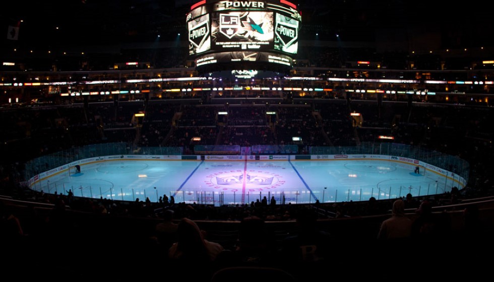
The Los Angeles Kings have unveiled a new logo that draws inspiration from the 1990s Gretzky era, aiming to bridge the past and the present in a dynamic fashion. This updated emblem serves as a tribute to a historic period while embracing new ambitions for the franchise's future.
A Nod to Gretzky's Era
Wayne Gretzky's time with the Kings had a profound impact on the team's branding, and the new logo revives the cherished "Chevron" design from his era. The revival is a strategic move to connect those historic moments with future aspirations, capturing the essence of the franchise's rich history and evolution.
The reimagining of elements from the early 90s jerseys is clear in the new design. Notably, "Los Angeles" is prominently featured at the top, reinforcing the team's strong identity. Additionally, an updated version of the original 1967 crown is included, blending past and present elements seamlessly.
A Comprehensive Redesign
The new logo replaces the former one unveiled in 2008, marking the culmination of a two-year redesign process that the Kings meticulously pursued. This extensive effort highlights the franchise’s dedication to honoring its storied past while resonating with today’s audiences.
Luc Robitaille, a significant figure in the Kings' history, emphasized the collaborative nature of the project. "This has been an extensive and collaborative process, and we are thrilled to roll this out to our fans and the city of Los Angeles," Robitaille remarked, underscoring the shared effort behind the redesign.
The Kings involved feedback from both past and current players, ensuring the new logo resonates across generations. "This evolution is rooted in our 57-year history and embraces the elements of our eras," Robitaille added. "It also involved interface and feedback with players both past and present, and it sets the stage for extensions and new iterations in the future."
Organizational Pride
The pride in the new design is evident throughout the Kings organization. Kelly Cheeseman highlighted this sentiment, noting, "From ownership to our players, our organization is proud to usher in a new era of LA Kings Hockey. We are excited for our fans to be part of this with us."
The new logo represents more than just a visual update; it symbolizes the franchise's journey and future aspirations. It is a fusion of classic and modern elements, designed to strike a chord with fans old and new.
Launch and Availability
The new logo will be available for purchase starting Friday, June 21, at the Crypto.com Arena's Team LA Store. This launch event is expected to draw significant attention from fans eager to embrace the new era of the LA Kings.
In summary, the redesigned logo of the Los Angeles Kings serves as a bridge between the past and the present. It encapsulates the franchise's rich history and evolution while setting the stage for future possibilities. This homage to the Gretzky era, combined with modern touches, reflects a comprehensive and thoughtful process aimed at resonating deeply with fans.
As the franchise steps into a new chapter, the new logo stands as a testament to their journey, honoring historical moments and embracing the ambitions that lie ahead. The excitement within the organization is palpable, and fans are eagerly anticipating being a part of this new era of LA Kings Hockey.